
Michaels
TOGETHER WE LIFT LIVES
For almost 50 years, The Michaels Organization has been a national leader in residential real estate, specializing in property development, management, construction and financing. What sets Michaels apart is their commitment to creating affordable housing solutions that lift lives and help communities thrive. A Michaels neighborhood is a beautiful place to call home that jump-starts education, civic engagement and community prosperity. It’s a launching pad for people to move to the next level of their lives.
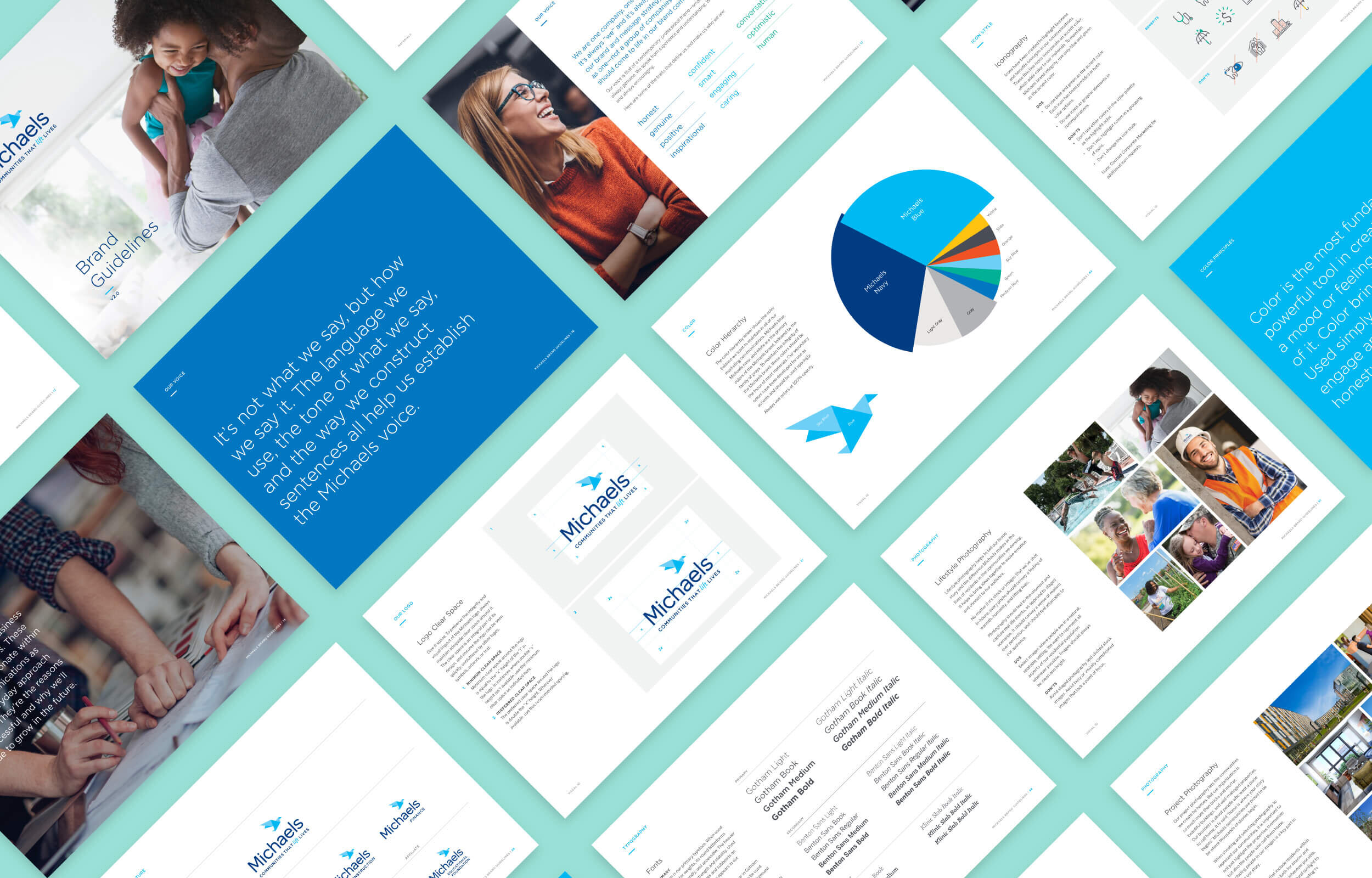
As The Michaels Organization grew over time, the brand no longer reflected their true mission. Charley was asked to create a new brand identity and tools to help the company more effectively create cohesive and effective communications. We developed an identity system that is contemporary, engaging and relevant to their residents, business partners and employees, in a way that’s uniquely Michaels.
PROJECT SCOPE
Brand Strategy
Brand Identity
Marketing Collateral
Web Design
Environmental Design
Promotional Items
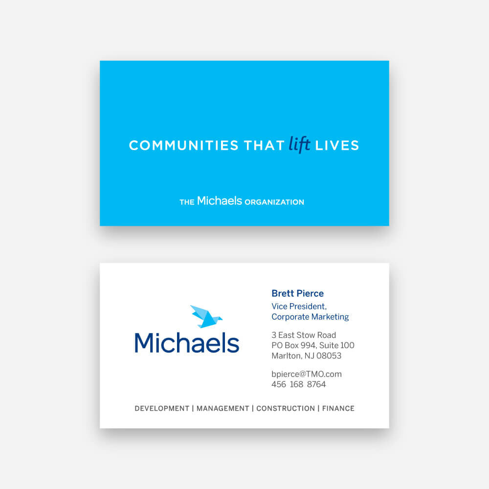
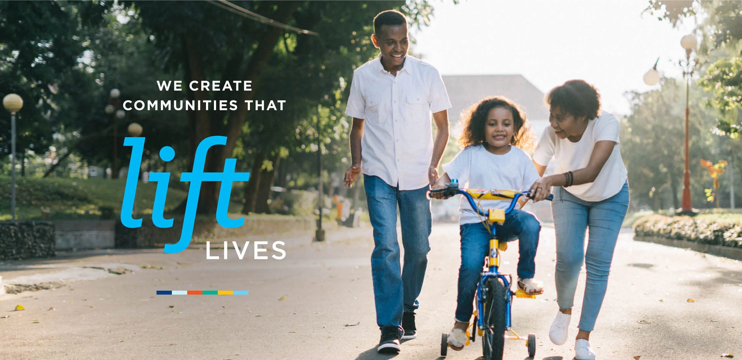
The brand promise, “Communities that lift lives” gives us the ability to tailor messages to different audiences and inspire them to think big and accept new challenges.
You may ask “What’s with the bird?” The bird of the new Michaels logo symbolizes their uplifting spirit, inspiring nature and ability to craft something beautiful. We positioned it in mid-flight to serve as a constant reminder of their vision, to always strive toward a better future.
Through collaborative sessions, vision boards and articulated Michaels brand attributes, Charley created the visual system, comprehensive brand guidelines, marketing collateral, core values book and new website.
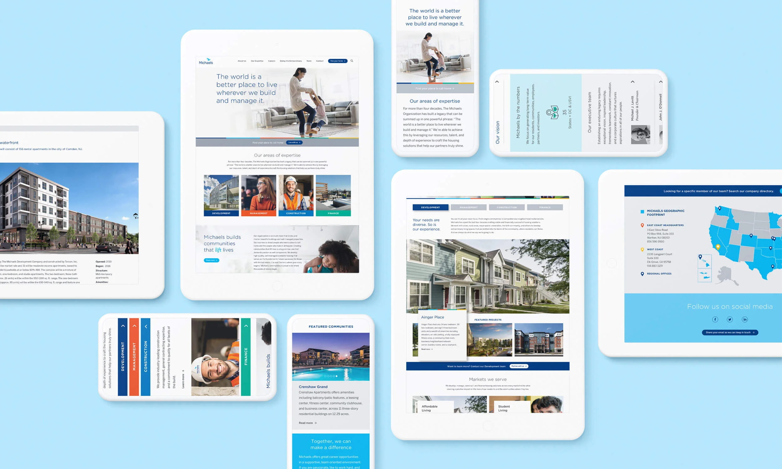
The website was designed for easy access to information on each of Michaels’ sub brands: Development, Management, Construction and Finance, while highlighting their projects across the multiple markets they target. The aesthetic is bright and modern balanced with engaging lifestyle imagery of the Michaels team and the residents they serve.


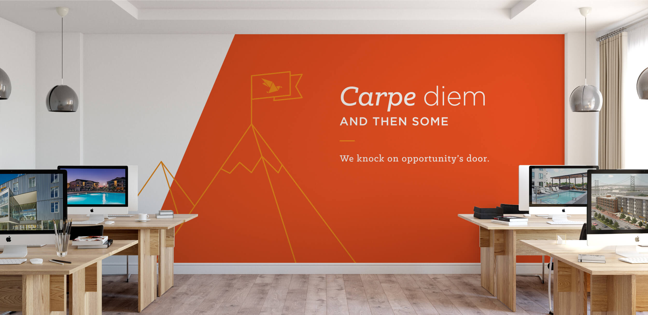
The core values are what makes Michaels, Michaels. We felt it was important for them be celebrated throughout the corporate office.
Charley created an environmental design plan that playfully lights up the Michaels office interior with brand elements and brings the company’s vision statements to life. The design is dynamic and inviting with bright, energetic colors and illustrations that illuminate each of the core values throughout the office’s community spaces. Conference room glass treatments highlight cities that are home to Michaels’ most significant properties to create a typographic texture and visual interest, as well as practical privacy screens.


The foundation of the Michaels visual language is the origami bird logo.
To us, the craft of origami perfectly parallels the Michaels mission. Just as a simple piece of paper is transformed into something beautiful, Michaels creates housing solutions — from blueprint to building and manages impressive properties that transform lives and uplift communities.


